 Compared to the current crop of technologies and platforms which have been released in recent years, .NET was released way back in 2000. However, the platform still seems to enjoy a loyal following among developers and enterprises across the globe, all of whom have made it their go-to choice for developing business apps - and is expected to be a prominent platform even in the year 2018. But why? To what does it owe its immense popularity? The following reasons enumerate why .NET is still considered a suitable platform for web development: Open Source: The Dotnet framework is Open source- one that is supported by a global community of developers. The developer community develops regular plugins and add-ons to aid in building customized business applications Ease of development: The syntax used in .NET is simple and learnt by millions of developers across the globe - all of whom offer an opportunity to expedite development and scale up the platform with ease. Agile and versatile: The .NET core is a highly flexible platform that allows several flexible modes of development. It allows developers to make use of Bootstrap layouts and javascript packages to simplify the development process and third party add-ons. This offers both time and security advantages as multiple layers of security can be integrated. In tune with trends: While the .NET framework has been around since 2000, the language itself has been constantly updated to incorporate new trends and features. Thanks to constant roll out of updates from Microsoft, the ASP.NET stack is regularly overhauled and stays at the cutting-edge Robust development tools: The most commonly used IDE for Dotnet is Visual Studio which allows for easy development of code and simplified integration. Visual Studio also simplifies other critical development activities such as debugging, bug identification, code completion, git integration, and unit testing. If you are looking to invest in .NET application development, then get in touch with Openwave, a global expert in .NET technologies.
0 Comments
 Web design and fashion share a commonality: they are both never finished. Every year, newer trends and themes hit the internet and WordPress developers across the globe take notice and incorporate the same. 2018 is no different in this regard. This year too, there are a host of new trends that have emerged and are likely to be adopted by thousands of websites across the globe. Here are some of the trends that you should pay attention to: 1. Color Themes: With bright screens of monitors and smartphones, customers today prefer to view colors that are easy on the eye. With consumers spend large amounts of time glued to their smartphone screens, opting for a color palette that is simple and visually docile can retain customer attention. 2. Fonts and Typography: Today, a significant chunk of the internet traffic originates from smartphones and far surpasses traffic from desktop browsers. With this being the case, it is better to opt for large fonts with bold typefaces. 3. Subtle Graphics: The trend is now in favor of graphics that appear hand-drawn as opposed to ones that are bright and digitally rendered. Opt for crisp and subtle graphics and add life to your website. A simple cartoon embedded within the website can be used as your brand ambassador. 4. Simple and Intuitive Animation: Today, recurring animations developed using JavaScript are the trend. These simple and subtle animations are used in place of video animations as they are easy to load and work well even on mobile websites. 5. Push Notifications: Push notifications for websites are the new norm as they allow businesses to send notifications right to the desktop and increase the number of redirects to their web pages. They are preferred by customers as they are not as obtrusive as pop-up ads. 6. Augmented Reality: Leveraging the widespread use of webcams on laptops and the advanced cameras on smartphones, today, several websites are offering augmented reality applications on their web pages. This is an effective way of targeting customers individually and improving sales conversion rates. Incorporating these trends into your website is now easy. Partner with globally acclaimed WordPress designers such as Openwave to develop a website that is tailor-made to suit the needs of your business and also lends a fresh image to your brand. Get in touch with our business team today! 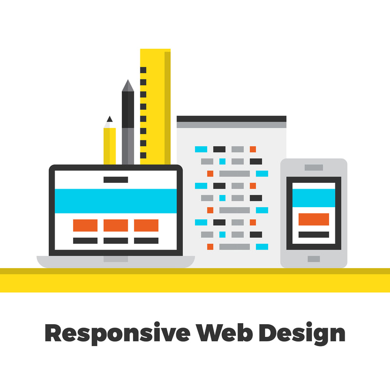 ‘If developing a new and fresh website is a part of your brand promotion plans, then you should consider a Responsive Website design’ - this is a statement that businesses all over the globe hear regularly. What is a responsive design and why is it in prominence lately? The answer has to do with smartphones. As smartphones become prominent the world over, they have led a shift in the internet consumption patterns. Today, most of the traffic reaches online through mobile browsers as opposed to desktops-based ones. This places an impetus on businesses to make their websites mobile phone-friendly and this is known as Responsive web design. What are the benefits offered by this style of web design? One-for-all design: When it comes to web development, maintaining multiple configurations to suit different devices can be resource intensive. In this scenario, opting for a design that adjusts itself across devices is a great way of reducing both development costs and maintenance costs. Enhanced SEO: Since November 2015, Google has opted for a mobile-first policy for its search engine ranking. This means that mobile websites will be given priority over desktop sites and mobile friendliness will be incentivized with better PageRank. Scalability: As these websites can adapt to any device, the scalability of your business can be made easy. When newer devices with different screen dimensions hit the market, your web page can automatically align itself with the screen of that device. Improved UI- A mobile-friendly site offers a better User interface, one that offers a seamless experience for users. It removes the need to scroll through or resize a website when accessed from a new device. It also improves the navigability within the website which helps reduce bounce rate. Competitive Edge: There are roughly 3 billion smartphone users on the planet. Developing a responsive website allows you to target all of these users and boost the value of your brand. If you are opting for a mobile-friendly website, then choose Openwave. We are a leading website development company in Malaysia and have partnered with several global brands for their branding and website needs. |
AuthorAm a Senior Business Analyst @ OpenWave Computing (M) Sdn Bhd in Malaysia. Archives
September 2019
Categories
|
 RSS Feed
